Nike
(1964- )
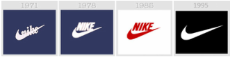
The classic Nike "swoosh" has remained primarily unchanged since the company start-up date. Iconic in our modern world, the swoosh is an easily accessible, replicable, and rememberable design. Its simplicity makes it stand out against other more complicated designs. I enjoy how nike has altered ever-so slightly to remain modern and compliant. The single swoosh, without any writing or detail, stands out and is recognizable across the globe.
Coca-Cola
(1892- )
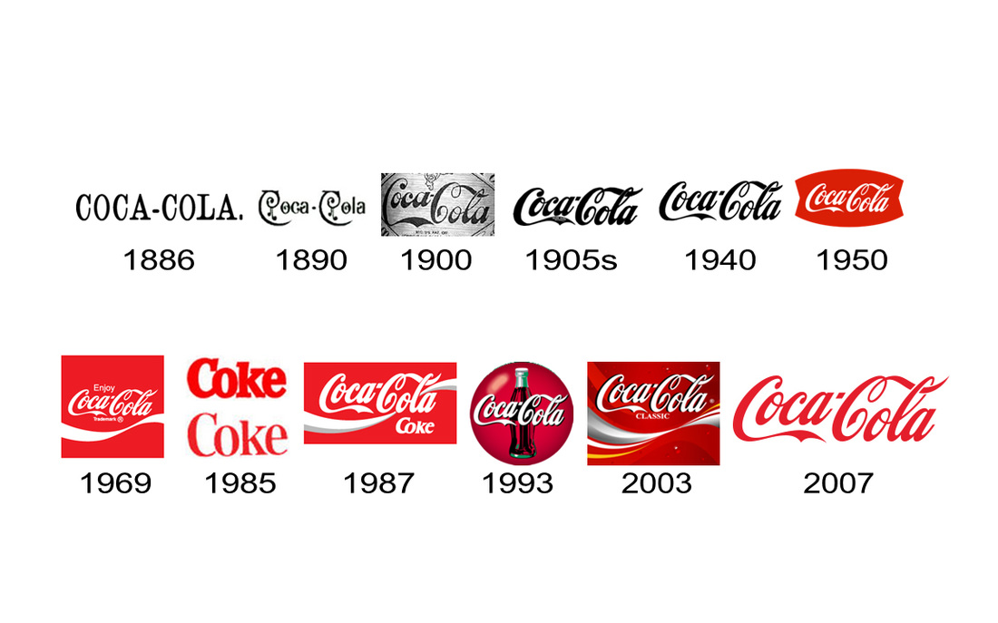
The Coca-Cola logo has maintained a very similar style-base throughout its long career. They all maintain a form of calligraphic writing of the product name. Besides their failed attempt at refacing the company as just "Coke" in 1985, the logo is relatively consistent! Once the script style of the logo was established, the Coca Cola company is definitely seen to experiment with the backgrounds of all their logos. This allows them to refresh and maintain interest with consumers while also remaining compliant with their iconic values.
Jim Beam Whiskey
(1795- )
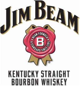
Jim Beam whiskey company is one of America's oldest running companies. This long-standing brand is evident in their logo design. Since the company is so old, they almost have more freedom in their design. They do not need to alter as much with the times because no matter what audience they are targeting, Jim Beam's name and identity has been present in every current generation. The classic style of their logo shows an older, vintage, more traditional style than other liquors of today. In comparison with other liquors like Ciroc, which is cultivating their logo to match the modern simple styles of today's, Jim Beam is able to continue to use their traditional logo design because of the relevancy and timespan of their company.
Apple Inc.
(1976- )
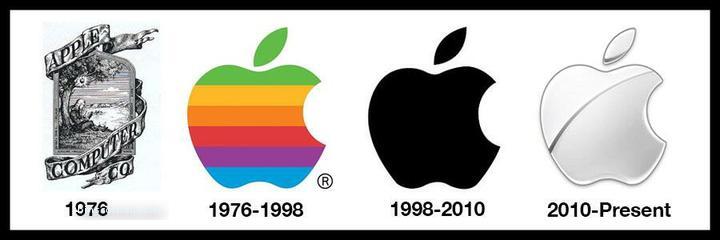
The Apple company logo is prevalent in almost every aspect of American culture. Our laptops, cell phones, tablets, etc. often all portray the iconic apple. However, the logo ha definitely shown dramatic changes in comparison with other iconic companies. Originating as an almost classic, liquor-like logo in 1976, the company's image was forced to change as computer technologies became more relevant in everyday life. It would've been very difficult, if not impossible, to depict the complicated original logo on computer products. Also, as technology advanced, the "old-fashioned" design could have possible portrayed a less advanced system and reduced sales because of the vintage fashion. For whatever reason, Apple simplified and condensed their design to an iconic silhouette that is easily replicated and remembered across the world. Even though the color scheme has varied throughout the years, the image has remained the same.
Pepsi-Cola
(1898- )
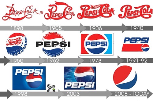
The Pepsi-Cola company logo is now iconic in its Americana color scheme and simplistic rounded silhouette. However, the logo has dramatically changed throughout its lifespan. Originally, the logo almost resembles the Coca-Cola red script that has become the sole image of the company. I assume that this caused much confusion between the brands and since the products were also very similar if not identical. Pepsi then began finally in 1950 to reimagine their identity by placing their script on a bottle cap. It was from this image that the rounded form that is so recognizable now, emerged. They also shortened their company name to become more distinguishable from other cola companies. Now "Pepsi" the simplified bottle cap and name maintain iconic values in today's market by keeping up with modern styles.